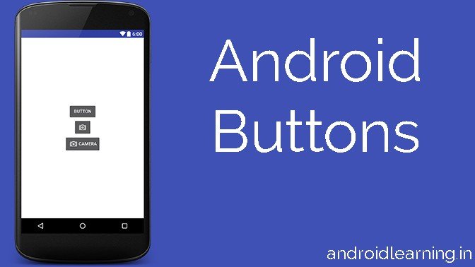
Android buttons consists of text or an icon (or both text and an icon) that communicates what action occurs when the user touches it.
![]()
Depending on whether you want a button with text, an icon, or both, you can create the button in your layout in three ways:
- With text, using the
Buttonclass:<Button android:layout_width="wrap_content" android:layout_height="wrap_content" android:text="@string/button_text" ... /> - With an icon, using the
ImageButtonclass:<ImageButton android:layout_width="wrap_content" android:layout_height="wrap_content" android:src="@drawable/button_icon" ... /> - With text and an icon, using the
Buttonclass with theandroid:drawableLeftattribute:<Button android:layout_width="wrap_content" android:layout_height="wrap_content" android:text="@string/button_text" android:drawableLeft="@drawable/button_icon" ... />
Responding to Click Events
When the user clicks a button, the Button object receives an on-click event.
To define the click event handler for a button, add the android:onClick attribute to the <Button> element in your XML layout. The value for this attribute must be the name of the method you want to call in response to a click event. The Activity hosting the layout must then implement the corresponding method.
For example, here’s a layout with a button using android:onClick:
<?xml version="1.0" encoding="utf-8"?>
<Button xmlns:android="http://schemas.android.com/apk/res/android"
    android:id="@+id/button_send"
    android:layout_width="wrap_content"
    android:layout_height="wrap_content"
    android:text="@string/button_send"
    android:onClick="sendMessage" />
Within the Activity that hosts this layout, the following method handles the click event:
/** Called when the user touches the button */
public void sendMessage(View view) {
    // Do something in response to button click
}
The method you declare in the android:onClick attribute must have a signature exactly as shown above. Specifically, the method must:
Using an OnClickListener
You can also declare the click event handler programmatically rather than in an XML layout. This might be necessary if you instantiate the Button at runtime or you need to declare the click behavior in a Fragment subclass.
To declare the event handler programmatically, create an View.OnClickListener object and assign it to the button by callingsetOnClickListener(View.OnClickListener). For example:
Button button = (Button) findViewById(R.id.button_send);
button.setOnClickListener(new View.OnClickListener() {
    public void onClick(View v) {
        // Do something in response to button click
    }
});
Styling Your Button
The appearance of your button (background image and font) may vary from one device to another, because devices by different manufacturers often have different default styles for input controls.
You can control exactly how your controls are styled using a theme that you apply to your entire application. For instance, to ensure that all devices running Android 4.0 and higher use the Holo theme in your app, declare android:theme="@android:style/Theme.Holo" in your manifest’s<application> element. Also read the blog post, Holo Everywhere for information about using the Holo theme while supporting older devices.
To customize individual buttons with a different background, specify the android:background attribute with a drawable or color resource. Alternatively, you can apply a style for the button, which works in a manner similar to HTML styles to define multiple style properties such as the background, font, size, and others. For more information about applying styles, see Styles and Themes.
Borderless button
One design that can be useful is a “borderless” button. Borderless buttons resemble basic buttons except that they have no borders or background but still change appearance during different states, such as when clicked.
To create a borderless button, apply the borderlessButtonStyle style to the button. For example:
<Button
    android:id="@+id/button_send"
    android:layout_width="wrap_content"
    android:layout_height="wrap_content"
    android:text="@string/button_send"
    android:onClick="sendMessage"
    style="?android:attr/borderlessButtonStyle" />
Custom background
If you want to truly redefine the appearance of your button, you can specify a custom background. Instead of supplying a simple bitmap or color, however, your background should be a state list resource that changes appearance depending on the button’s current state.
You can define the state list in an XML file that defines three different images or colors to use for the different button states.
To create a state list drawable for your button background:
- Create three bitmaps for the button background that represent the default, pressed, and focused button states.To ensure that your images fit buttons of various sizes, create the bitmaps as Nine-patch bitmaps.
- Place the bitmaps into the
res/drawable/directory of your project. Be sure each bitmap is named properly to reflect the button state that they each represent, such asbutton_default.9.png,button_pressed.9.png, andbutton_focused.9.png. - Create a new XML file in the
res/drawable/directory (name it something likebutton_custom.xml). Insert the following XML:<?xml version="1.0" encoding="utf-8"?> <selector xmlns:android="http://schemas.android.com/apk/res/android"> <item android:drawable="@drawable/button_pressed" android:state_pressed="true" /> <item android:drawable="@drawable/button_focused" android:state_focused="true" /> <item android:drawable="@drawable/button_default" /> </selector>This defines a single drawable resource, which will change its image based on the current state of the button.
- The first
<item>defines the bitmap to use when the button is pressed (activated). - The second
<item>defines the bitmap to use when the button is focused (when the button is highlighted using the trackball or directional pad). - The third
<item>defines the bitmap to use when the button is in the default state (it’s neither pressed nor focused).
Note: The order of the
<item>elements is important. When this drawable is referenced, the<item>elements are traversed in-order to determine which one is appropriate for the current button state. Because the default bitmap is last, it is only applied when the conditionsandroid:state_pressedandandroid:state_focusedhave both evaluated as false.This XML file now represents a single drawable resource and when referenced by a
Buttonfor its background, the image displayed will change based on these three states. - The first
- Then simply apply the drawable XML file as the button background:
<Button
    android:id="@+id/button_send"
    android:layout_width="wrap_content"
    android:layout_height="wrap_content"
    android:text="@string/button_send"
    android:onClick="sendMessage"
    android:background="@drawable/button_custom"  />
For more information about this XML syntax, including how to define a disabled, hovered, or other button states, read about State List Drawable.


